Dec 23, 2007
Word meaning in FLASH
This is a short flash I did to explain the word meaning "HEAVY". See flash to understand :D.
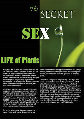
Poster for safe Sex
Dec 9, 2007
Photographer - Dirk Lambrechts - Colorful
A2A - My Portrait

This is the portrait I did for assignment A2A. According to the requirement of the guide. The picture can tell inside myself. As the requirement, I think I am a quite person, I usually don't like talking with stranger people. Moreover, I'm also don't like talk about myself with another person, I only want silent. I think this photo can attract mostly about myself.
Nov 25, 2007
Graffiti Font
Safe Sex Poster
Nov 18, 2007
Windows Media Styles
Banner For Blog!!!
Nov 11, 2007
Text & Font : gestalt_theory
Nov 4, 2007
Human mood by colors
 I created this picture with name " Human mood ". First of all, I wanted to create 4 faces with others mood ( fun, cry, angry, sad ), but I found that, my picture did not describe all of my idea. I came up again with slide. I found the value also create the mood. I tried up with other colors and found the best colors for my work.
In the picture : I change the color form green to black, but three main colors in my picture are : green, red and black. It's also create 3 different mod of human : happy, stress and extremely despair ( want to be died ).
Simple is the best

This title is " simple is the best " , the idea came with me when I scan slide form Blackboard to find information. I use AI to create my idea, and I think it did not take a lot of time. But I think it explain full my idea.
Explain to my picture :
Colors: I choose 2 main color of all elements : Black and White . It's also the most simple colors in our life.
Font : Arial font , no caps-lock, no bold .
Dang Le
Subscribe to:
Comments (Atom)


